theme :: spoke

A product site that feels like your CLI.

Spoke is a complete spoke-code site for developer tools: a boot sequence, a dithered backdrop that follows the scroll, a reticle that locks onto every control, and real sections ready to rewrite. Pick it once and keep getting updates.

readout

  • theme ......... spoke
  • stack ......... next.js 16
  • content ....... files or sanity
  • setup ......... 3 questions

play spoke.mp4

Watch it run.

Eighteen seconds of the real theme, recorded from the live demo.

  • Spoke

    The boot sequence, a backdrop that moves with the scroll, the reticle locking onto the console bar, a terminal session replaying, the file tree opening, and the pricing switch flipping to yearly.

    • Next.js
    • React
    • Tailwind CSS
    • Files or Sanity
    npx spoke-code create my-site --theme spoke
    Open the live demo

ls components/

Every piece, up close.

Real screenshots of the running theme. Click any of them to see it full size.

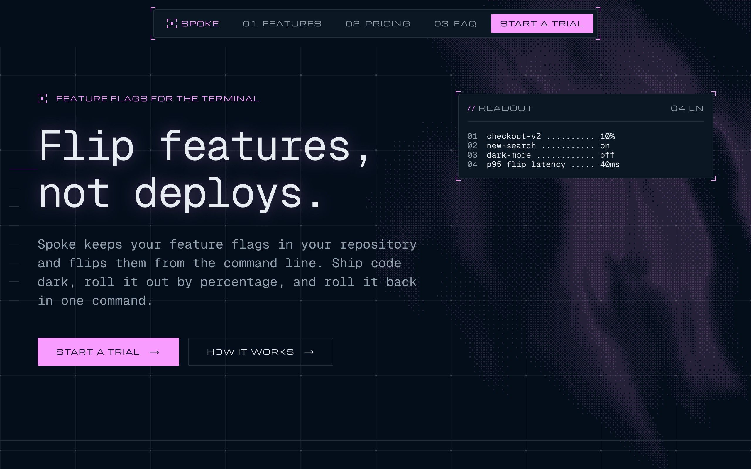
  • The Spoke front page: the console bar with its links and trial button, the headline Flip features, not deploys, and a readout panel of live flag values over a dithered backdrop.

    hero

    A hero that says it in one line

    The promise, two buttons, and a live readout beside the copy. The heading decodes in as the page settles.

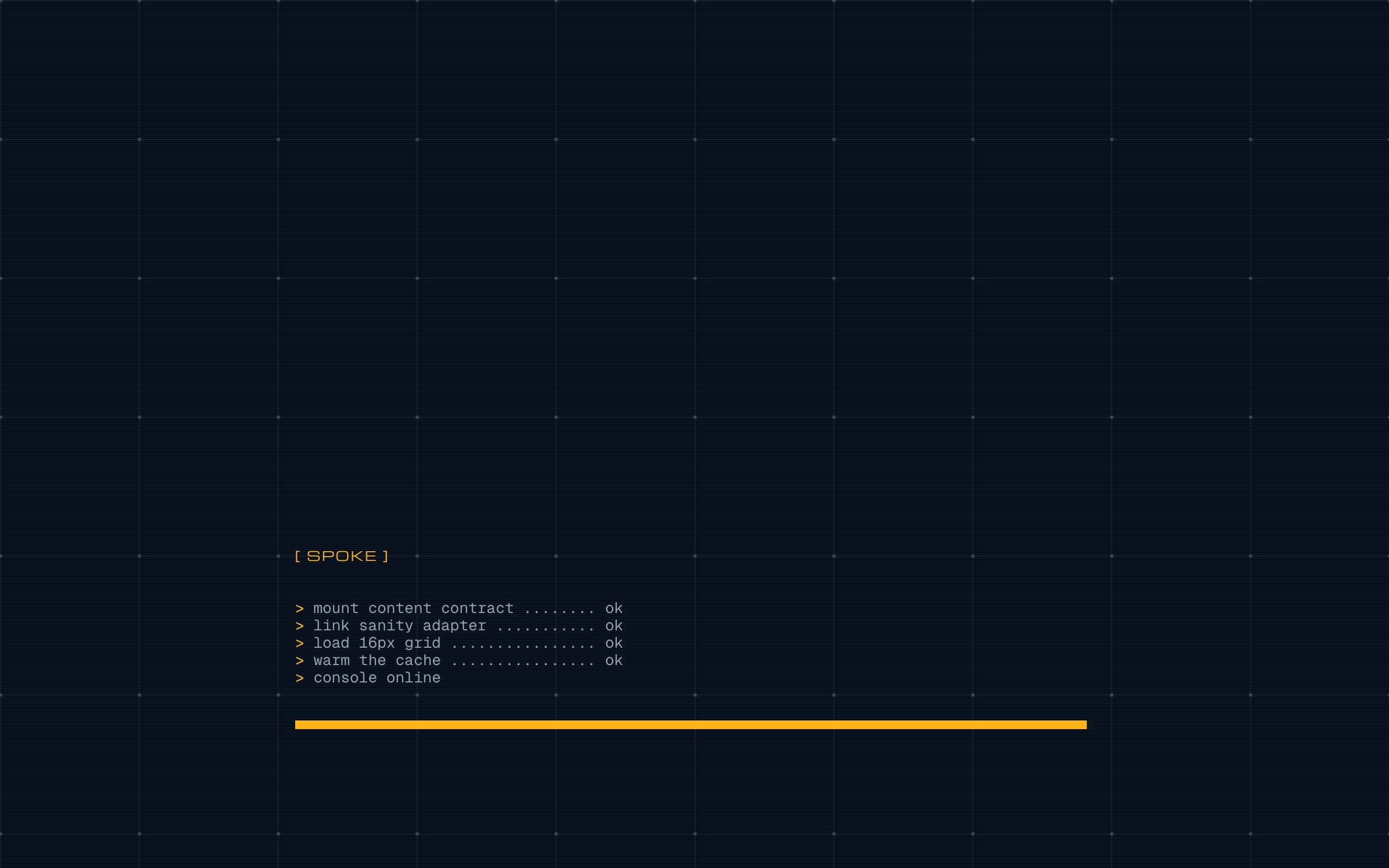
  • The boot sequence the first time a visitor arrives: a console prints its startup lines over a scan-lined grid before the site appears.

    bootSequence

    A boot sequence, once per visit

    First-time visitors get a console start-up before the page wipes in. It plays once a session, and never for people who prefer reduced motion.

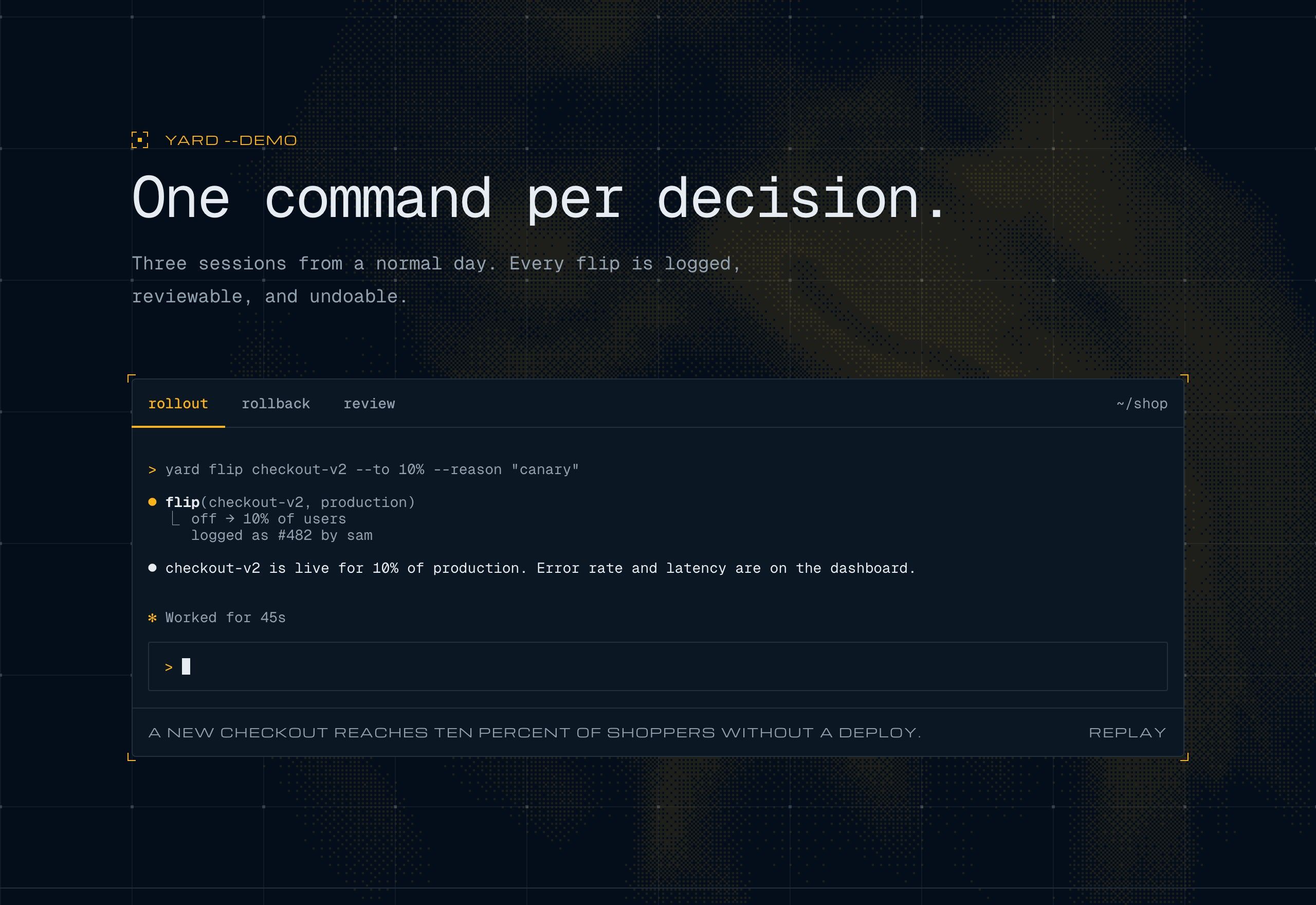
  • A terminal session replaying inside the page: a prompt, the assistant's reply, and the commands it runs with their output, one tab per session.

    agentSession

    A terminal that replays itself

    Show your tool working. Sessions type in line by line as they scroll into view, one tab per scenario.

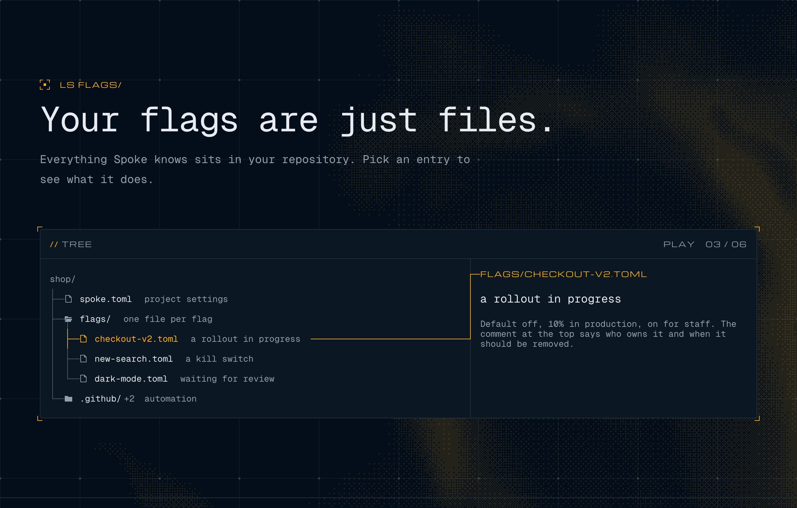
  • A file tree of the project with the flags folder open and a flag file selected, and a panel beside it explaining what the file is for.

    fileTree

    Your project, explained

    Folders open on click, and each file says what it is for, so the product explains itself without a docs page.

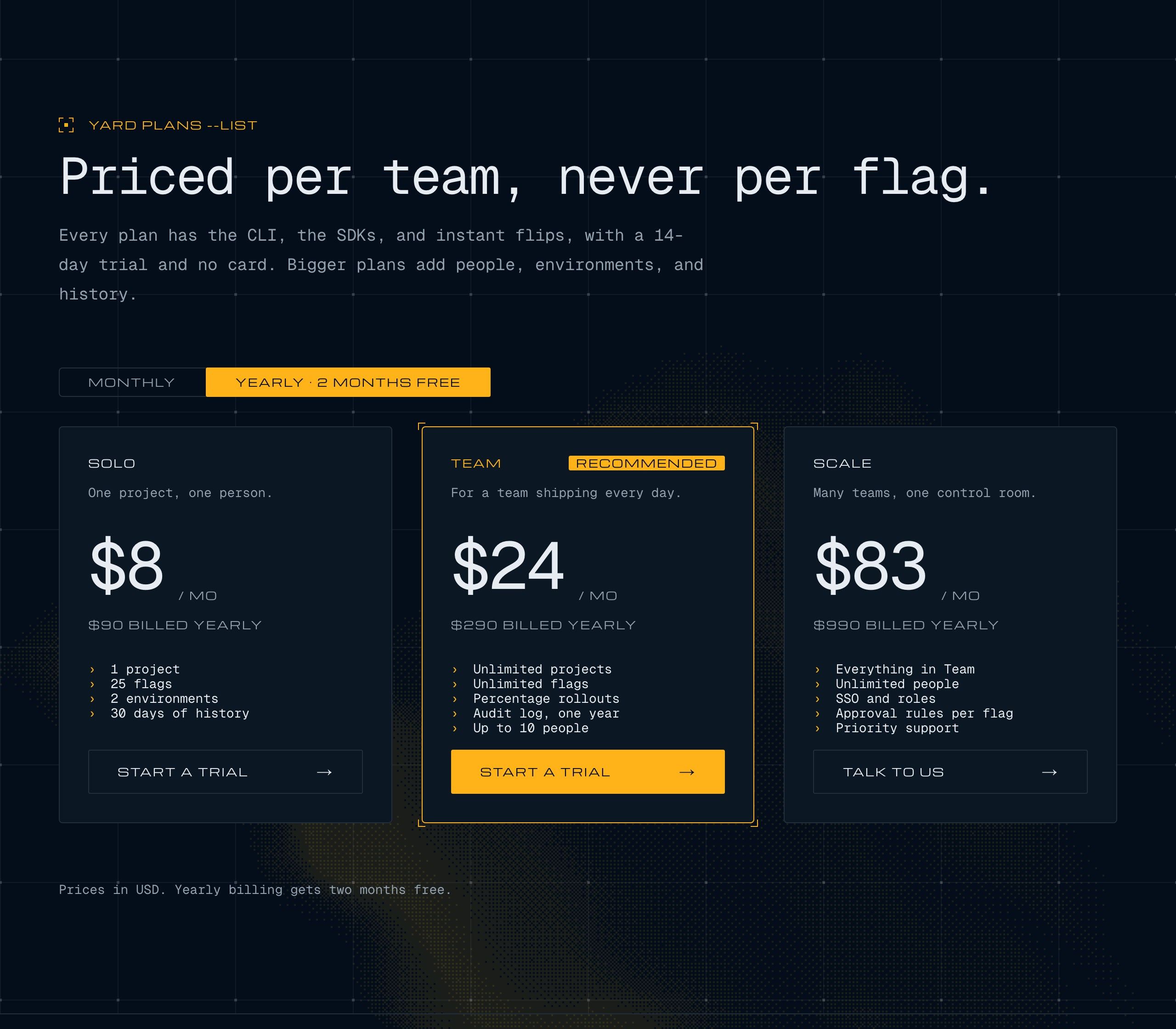
  • Three pricing plans side by side with the monthly and yearly switch set to yearly, and the prices recalculated.

    pricing

    Pricing with a yearly switch

    Three plans, a recommended one, and a toggle that recalculates every price.

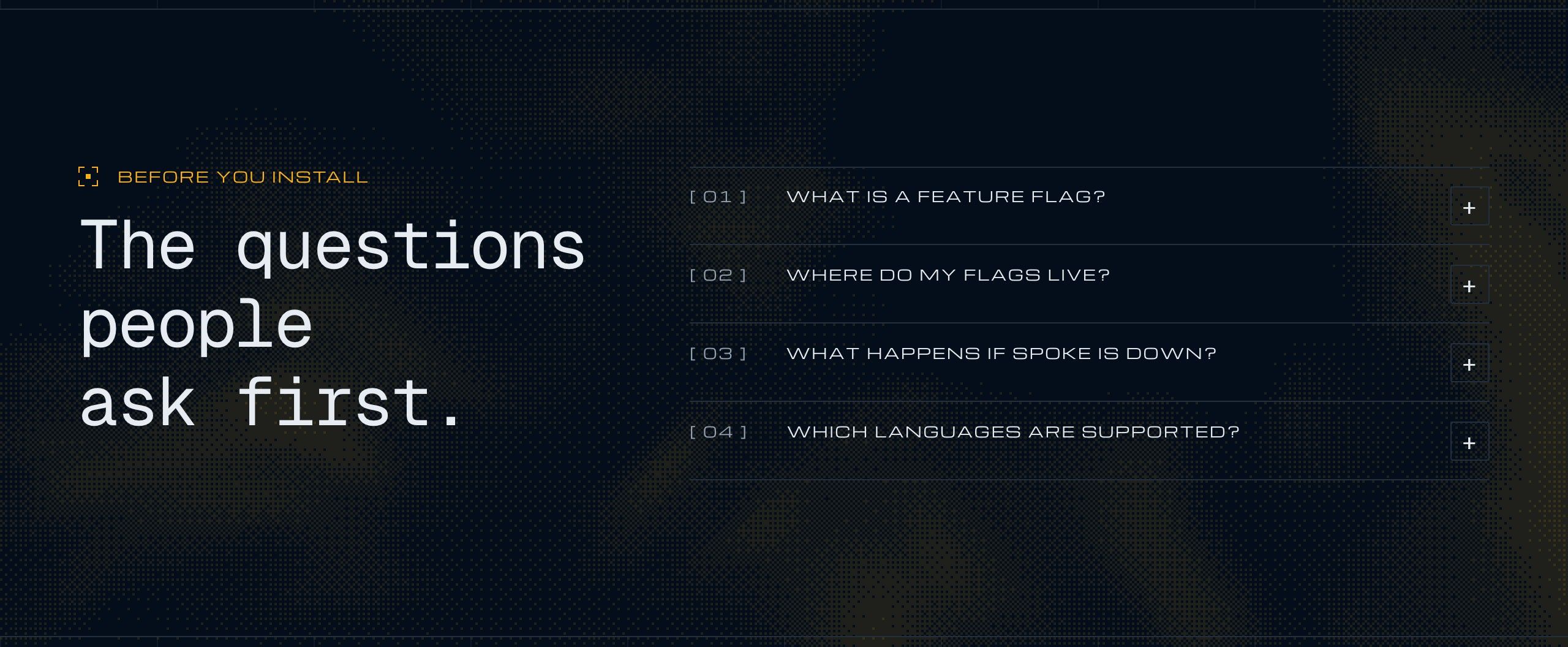
  • A list of common questions where one is open and shows its answer, the rest closed.

    faq

    Questions, answered in place

    An accordion that opens one answer at a time and works from the keyboard.

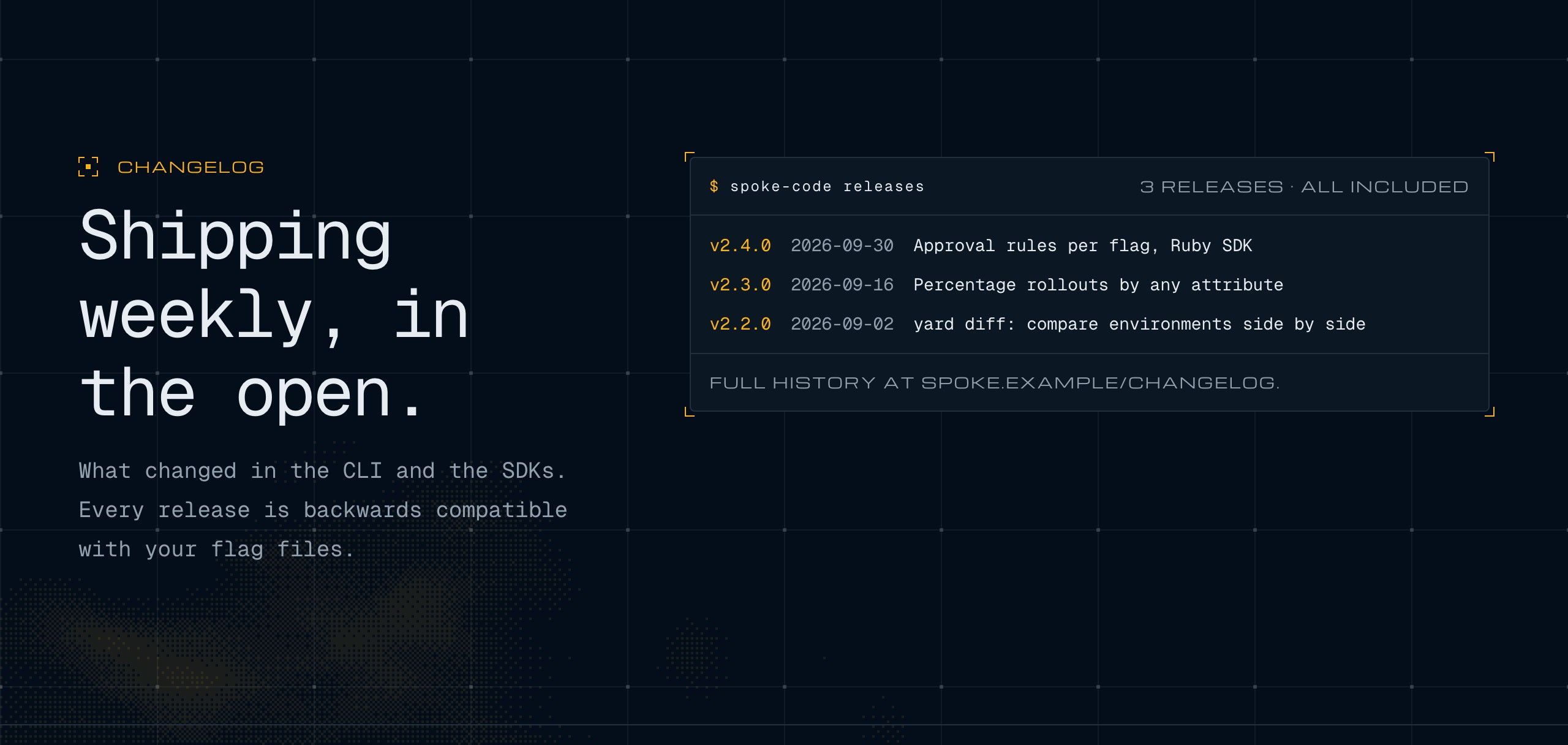
  • A console panel listing the product's releases, one row per version with its date and a line on what changed.

    releaseLog

    A changelog that looks like a console

    Versions, dates, and a line on what changed. Fill it from your own release workflow.

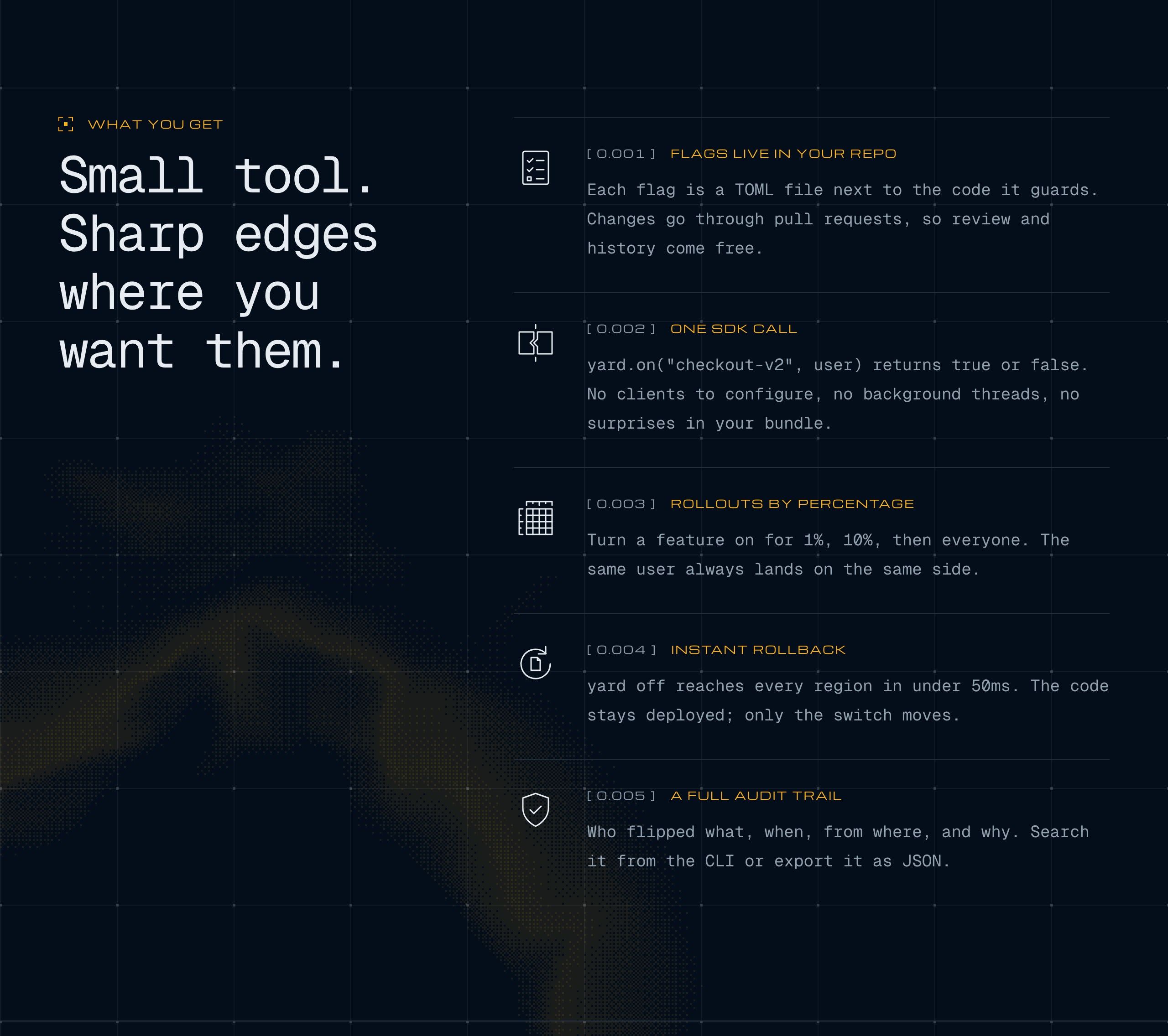
  • A numbered log of features, each with an icon and a line of copy, with the section's heading pinned beside it.

    featureList

    A numbered log of what ships

    Every feature gets an icon and a line, with the heading pinned beside the list.

cat DETAILS

Built for the details people notice.

  1. [ 0.001 ]One 16-pixel grid, everywhere

    Every margin, line height and frame sits on the same grid, and a test checks it on every build.

  2. [ 0.002 ]Accessible by default

    Built on Radix, with real keyboard support, reduced-motion handling, and an accessibility check on every component.

  3. [ 0.003 ]Sections you can rewrite

    Eleven blocks, from hero to pricing, already wired to your content. Change the words and keep the structure.

  4. [ 0.004 ]A pointer that means it

    On desktop a reticle locks onto every link and button with a coordinates readout. It never takes a click.

  5. [ 0.005 ]Your color in one answer

    Setup asks for a brand color, and the whole accent follows it: buttons, highlights, even the dithered backdrop.

  6. [ 0.006 ]Updates keep coming

    Choose the theme once. spoke-code update brings every new release into your site and keeps your changes.

brandColor=

Your color, the whole site.

The same front page in four brand colors. One answer during setup, and you can change it any time.

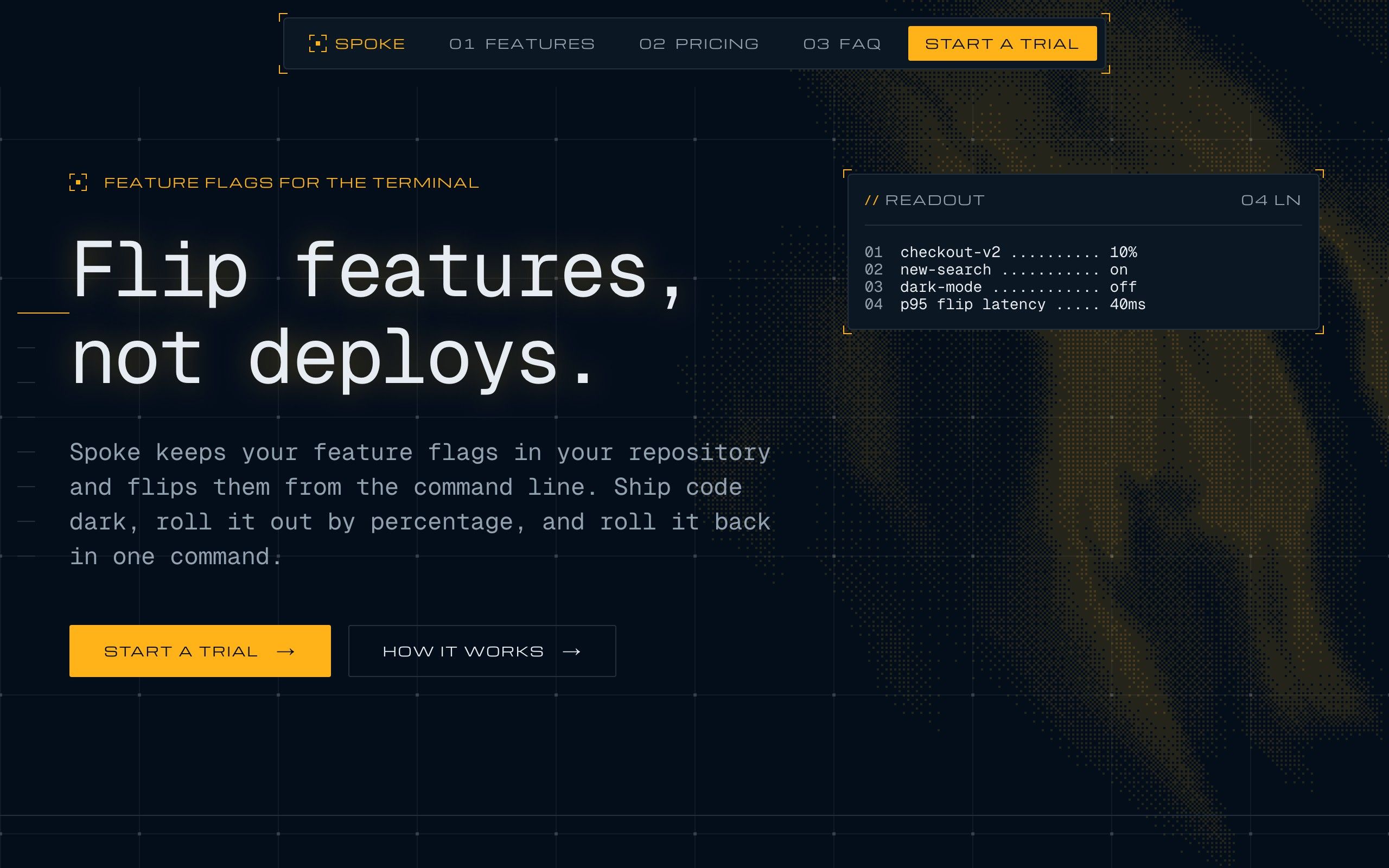
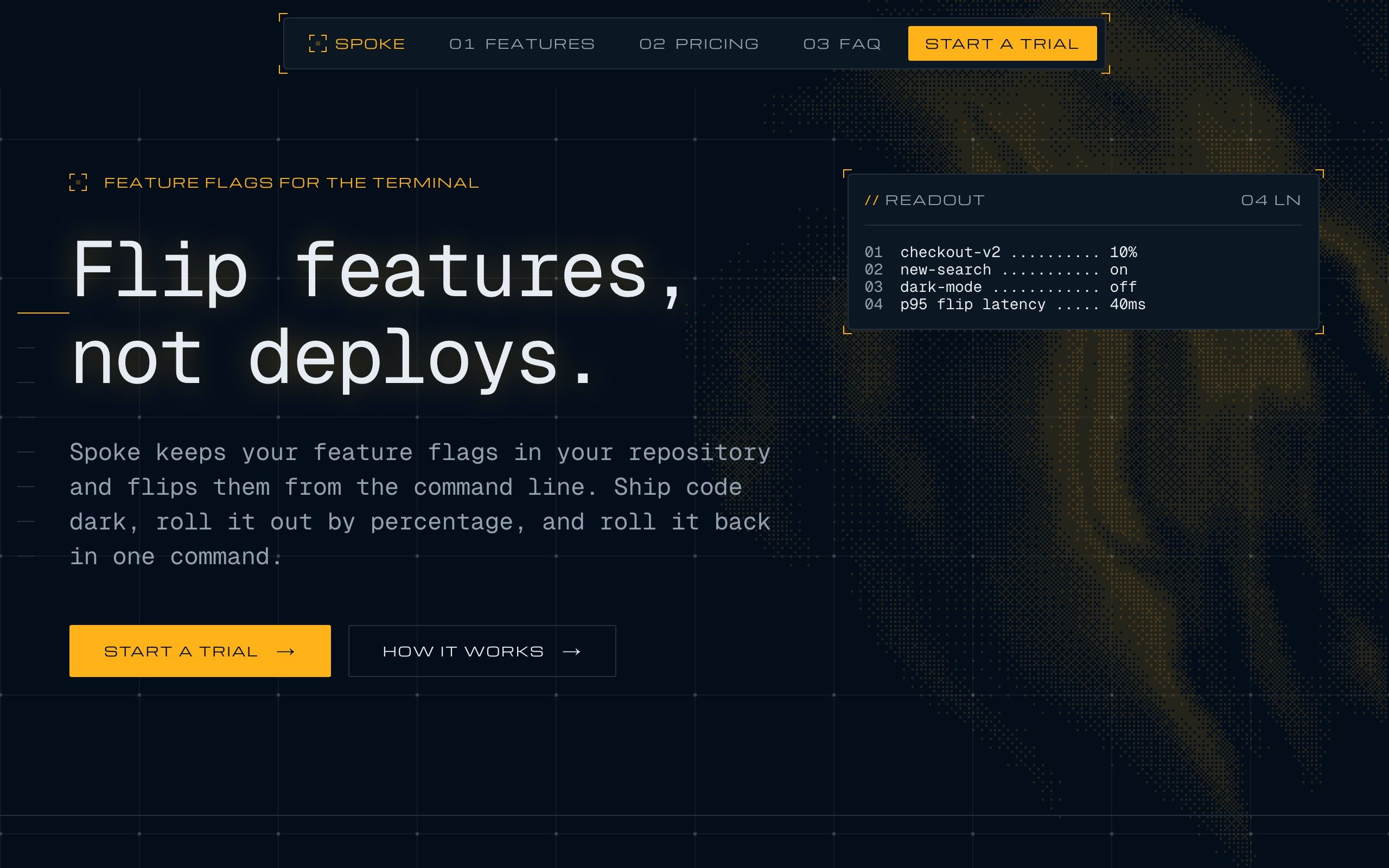
  • The Spoke front page with its brand color set to amber: the buttons, highlights and readout take the new color.

    #ffb113

    Amber

    The default.

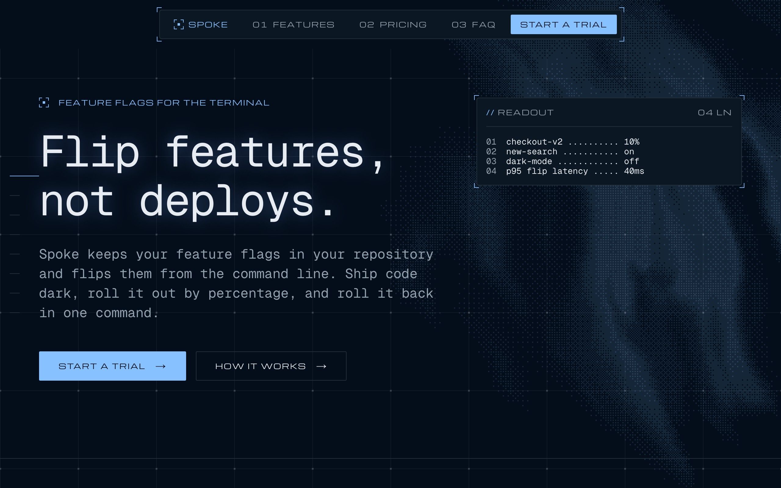
  • The Spoke front page with its brand color set to blue: the buttons, highlights and readout take the new color.

    #2563eb

    Blue

    Cool and calm, for infrastructure.

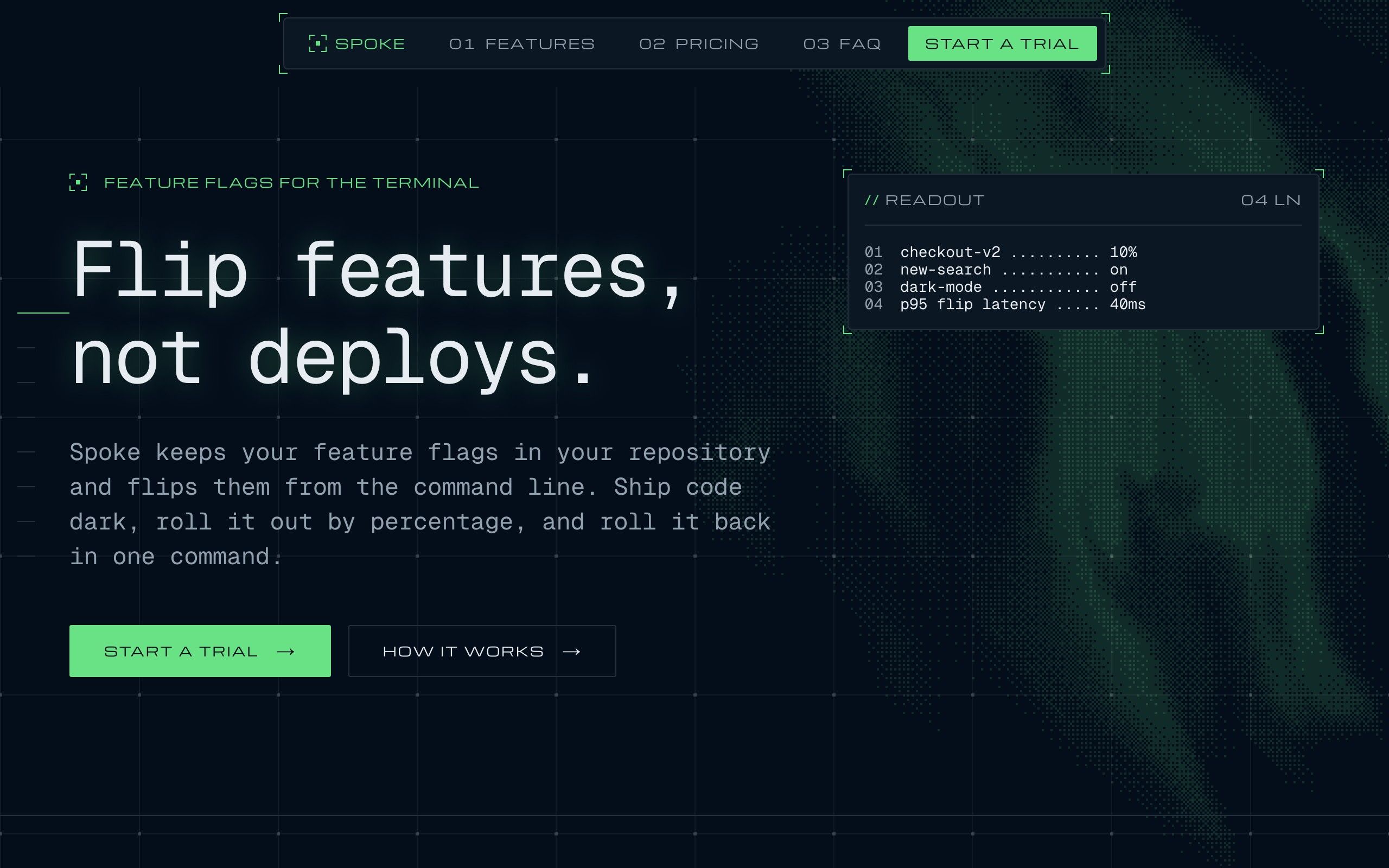
  • The Spoke front page with its brand color set to green: the buttons, highlights and readout take the new color.

    #16a34a

    Green

    Fresh, for anything that ships and passes.

  • The Spoke front page with its brand color set to magenta: the buttons, highlights and readout take the new color.

    #c026d3

    Magenta

    Loud, for a product with a point of view.

/setup

Four questions, then it's yours.

Setup asks, writes your answers into the site, and starts it on your computer.

  1. [ 0.001 ]What is the site called?

    The name in the console bar and the browser tab.

  2. [ 0.002 ]In one sentence, what does it do?

    Shown to search engines and in link previews.

  3. [ 0.003 ]What is your brand color?

    A hex like #2563eb. The accent follows it everywhere.

  4. [ 0.004 ]Where should your content live?

    Plain files in your project, or Sanity as a web editor. Both work with Spoke, and neither needs a database.

man spoke

Questions about the theme.

Yes. Everything on the page is content: edit the words, reorder the sections, or add any of the eleven blocks. Ask your assistant, or edit the files or Sanity yourself.

npx spoke-code create

Start with Spoke.

One command makes the site. Setup does the rest.

npx spoke-code create my-site --theme spoke
Get the kit